WHAT IS BRAND IDENTITY & BRAND IDENTITY DESIGN?
Brand identity is the soul that you give your company. Simply put, it’s the uniform or cape you adorn that sets you apart from the competition, it can encompass design, culture, behaviour and communications amongst others elements.
But what is brand identity really? Here we will delve into the developmental process of brand identity and the design aspects of brand identity, explore brand identity prism and look at examples of how big firms incorporate brand identity into their design.
Table of Contents
- What is Brand Identity?
- Why Is Brand Identity Important?
- What Is Brand Image
- Why Is Brand Image Important?
- Brand Identity vs Brand Image
- Brand Identity Prism
- Development of Brand Identity
- Brand Identity Design
- Firefox Case Study
What Is Brand Identity?
To put it simply, Brand Identity is the assemblage of elements a company or team may use to create a particular image for their target audience. Brand identity can often be mistaken for ‘branding’ or ‘brand image’ even though these terms may be deemed offshoots of each other.
Essentially, brand identity is creating a design eco system using specific rules and standards adherent to the vision of the business using fonts, logo, colour palette, visuals and language. It’s what allows your customers or audience to recognise your business. We will take a look at examples of brand identity further down to give you a gist of how big organisations go about establishing a brand identity using colours, fonts and logo amongst other variables.
Let’s look at a few scenarios. Imagine a young girl that has just moved from a rural area into an urban city. She may be immediately identifiable as not a local from her dress sense or even the language or lingo that she does or does not use. In order to change that, she may observe and learn how other girls her age are dressing and using particular words for certain types of conversations, so in turn she adopts these traits to give off the impression that she is a city girl so that she fits in by creating a type of identity.
On the other hand, if a boy was not to fit into a football team, changing his identity may not be the most suitable approach, instead he may train harder to get better to impress his teammates.
Brand identity is a unique set of brand associations that the brand strategist aspires to create or maintain
David Aaker
Why Is Brand Identity Important?
Brand Identity allows customers to identify your products or services by the use of brand design. It establishes a connection between you and your audience and can have a huge impact on customer loyalty and determines how the world perceives your brand.
Establishing consistency is paramount in formalising a brand identity, using the same colour palette, tone of voice are common factors in being distinguished from the competition and help you to stand out. Take Coca Cola for example, when you’re shopping amidst a plethora of drink cans, the iconic red can and the font used, is instantly recognisable to you as Coke. Look at the Lamborghini Urus for example, it uses the same engine as an Audi Q7, but due the brand identity of being premium super car manufacturer, is able to fetch a far greater price by its badge alone.
Why brand identity is really important is that it can give your business a price premium, perception of quality, experience and reliability, recognition and loyalty and brand recognition.
What Is Brand Image?
To put it simply, brand image is the perception customers have of a brand. It is the set of ideals, impressions and beliefs they may form both consciously and subconsciously of a particular brand. Brand image conveys a mental value as much as it does an emotional one, this can be formed by their experiences of interacting with the brand, the association they make to the logo or colour scheme, to even the ethics of the organisation. Brand image can be established by coming into contact with your marketing material, your logo, website to even how your employees are uniformed.
Why Is Brand Image Important?
Think about it, when consumers purchase a service or product, it’s not just the product or service their buying into, its the values set forth by the image that your brand identity gives them. Brand image builds credibility, creates recognition and makes an impression. Brand image identifies your business values, services and products, wether that be them coming into contact with your website, business card or how your employees are dressed, it can all have a huge impact on how they will interact with your business.
An image is the set of beliefs, ideas, and impression that a person holds regarding an object
Philip kotler
Brand Identity vs Brand Image
The main difference between brand identity and brand image is the lens of perception. Brand identity is the set of element created to portray an image to the potential audience. Brand image on the other hand refer to how the audience forms an opinion of the brand.
Brand Identity Prism
Jean-Noël Kapferer, author and brand strategy consultant, devised a hexagonal diagram that conceptualised, what he believes to be the six core facets of a brands identity and how they relate to one another; thus the brand identity prism was born, otherwise know as Kapferer Brand Identity Prism. The age old communication model of having a sender, medium and receiver is embedded at the core of this philosophy, bringing into play how the elements figure externally and internally.
As you will see in the diagram, essentially, what Kapferer was trying to show us, was the relation between brand identity and brand image; brand identity being the ‘picture of the sender’ and brand image being the ‘picture of the receiver’, and the prism portrays them to be interlinked.
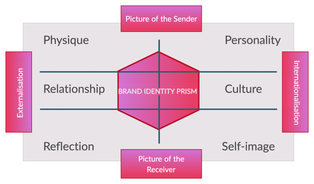
The key facets of Kapferer’s model are as follows
PHYSIQUE: As the title suggests, it is the tangible physical facets of a brand that people can visually perceive about your organisation; these include logo, colours palette, icons and typography and even website.
PERSONALITY: This leans towards the tonal voice, and behavioural aspects. These can also include colour palette and typography just as the physical elements of the marketing model (we will explore these more in depth later), but also the type of language the business chooses to use. For example, McDonalds use of the five syllable sound signature with their slogan ‘I’m Lovin’ It’, was created to give a young, hip and fun personality.
RELATIONSHIP: Essentially, this is the relationship between consumer and the brand; and this not just about a financial transaction, but is the relationship that is established at first contact and how it is maintained during and after the purchase process. This can be manifest with engagement on other social platforms to the service received during the purchase phase and to the how supported they will feel after the transaction is complete.
CULTURE: The values and culture can be derived from aspects such as the origin country of the brand, the target audience or even the mission statement of the business. An example of this can be Swiss watches, that have built up a reputation over generations that they produce the highest quality handmade watches; brands such as Tissot, even use the flag of Switzerland as part of their brand and logo.
REFLECTION: Who does your brand reflect on? who is the demographic? It’s about you as the brand, and how you perceive the brand in conjunction with potential audience. McDonalds may set out a vision to be a fast food chain that is for the younger demographic, when in reality they are an appeal to several age brackets and personalities.
SELF IMAGE: How does your customers visualise themselves? What do they want to achieve? Knowing the answer to these questions can help you position your brand to appeal to a certain type of person. An example of this can be The Body Shop, that positions themselves offering natural ingredients, cruelty free and ethically sourced products. One that may use such a brand can feel that they are impacting the world and feel ethically and morally satisfied.
So those are the six element that make up Kaperer Brand Identity Prism, but thats not all, those six element are separated on the diagram, but grouped together in four larger categories, these being picture of sender, picture of receiver, internalisation and externalisation. Kapferer proposed that all these elements serve each other and cohesively are the crux of a brand identity.
Development of Brand Identity
Many element can go into creating a brand identity, and although all are not necessary, the more custom you make it, the more you are likely to stand out from he crowd and embed yourself in the consumers psyche. Things to keep in mind when developing your brand identity can be business cards, logo, web design, uniform and even packaging.
Mission & Vision
It is wise to set out with a brand vision and mission plan. Brand vision refer to the developing ideas behind the brand which will serve as a guide for the future of the brand. It could be how to set your self apart form competitors, and how to reinforce and support your business strategy with a brand identity. A brand mission is basically a statement that affirms the brands purpose and objectives. These are great to inspire employees and let them gain an understanding of the culture, and also elevate to the customer the principles and objectives of the brand.
Communication & Language
The language and communication could refer to how you chose to present your brand in terms of tone. If you are selling legal advice, then using hipster terminology and dance music may not be ideal in a profession where you would want to present yourself as a professional organisation that takes matters serious.
Culture & Behaviour
As touched upon in the brand identity prism, this could be how you position your business in terms of relating the brand with a philosophy derived from a mission statement, or using the country of manufacturing to give a sense of identity. So, as a company, you may set out to use only recycled materials in product packaging and use electric vehicles to deliver your products, in turn, giving the impression that you care for the environment and that will appeal to certain parts of the market.
Let’s explore the different elements that can be used to form an architecture of a brand identity.
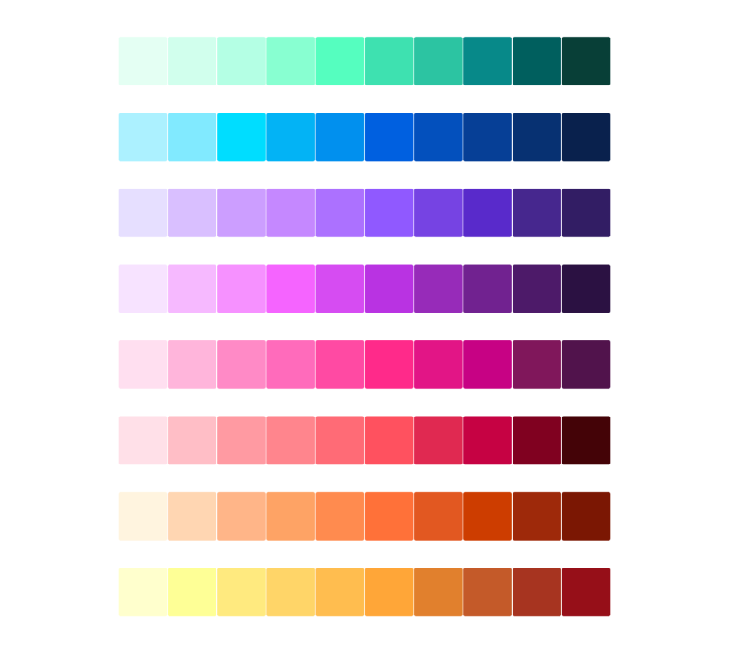
Colour Palette

Colours can play a huge part in the development of a brand identity. What some may not realise, is that they subconsciously make psychological association through their perception of colour on brands and logos. Take green for example, this colour is prominent with logos and brands that are environmentally conscious, as green can be associated with nature, this is why green is used on symbol of recycling. Firms as British Petroleum (BT), use a spectrum of green and yellow, and in the year 2000, implemented a green and yellow flower to their logo to symbolise ‘clean’ and ‘natural’, to counteract the image of an industry that is associated with pollution.
Let’s take a look at some more colours and what type of identity it may signify to ones perception of a brand or logo.
BLACK: This colour personifies sophistication and being modern, a timeless classic. Used to insinuate elegance and stability. Uber uses black as their app icon background and for the most of their marketing material. The palette they utilise is that of black, white and blue.
BLUE: Stability, confidence and loyalty is a what springs to mind when blue is in use. A colour that has been used by monarchs from medieval times to political parties today, it signifies intelligence and security, thats why financial organisations such as Paypal, American Express and Visa use blue in their logo.
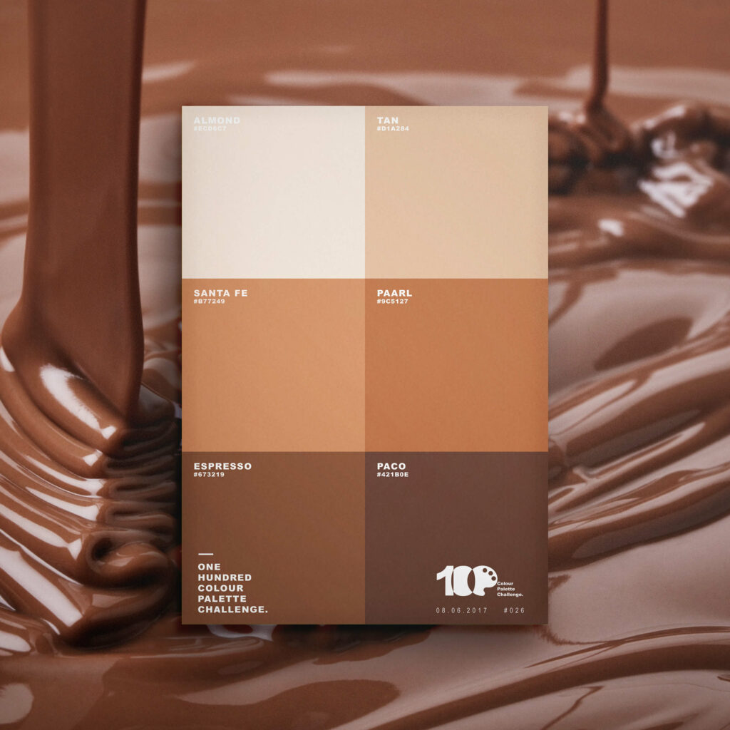
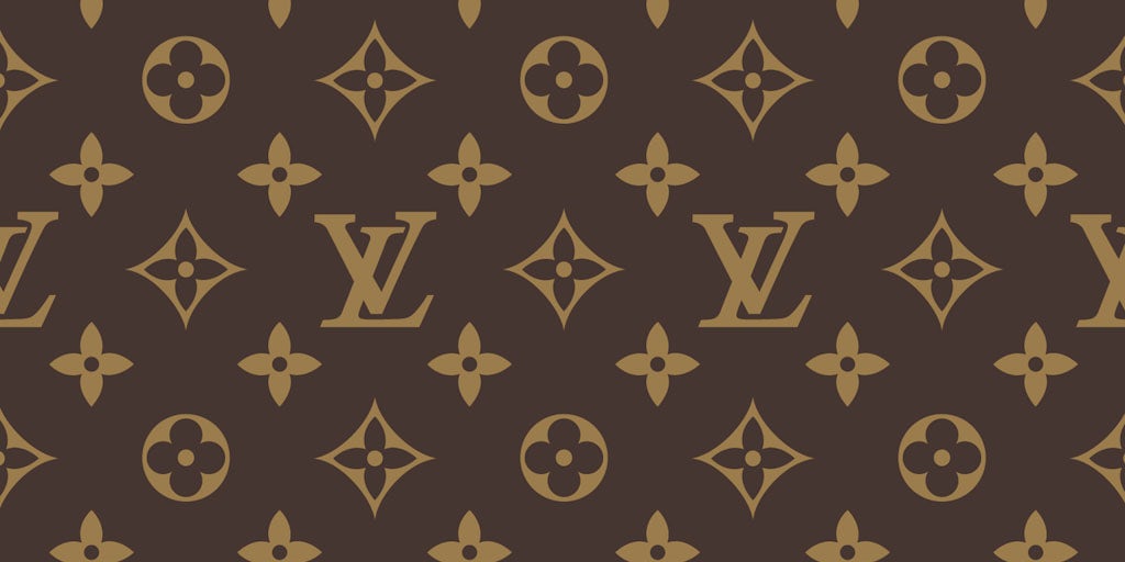
BROWN: A highly uncommon colour in brands, but this can be used to gain an advantage and stand out from the crowd. Brown can be related to warmth, earthy, foundation and wholesomeness. Usually found with coffee and chocolate brands, though high end designer brand, Louis Vuitton use it as their signature colour.
GREEN: As mentioned earlier, green can be associated with nature, but also health, peacefulness and growth. Brands such as Android, Tropicana and Macmillan Cancer Support use green as part of their brand identity.
ORANGE: This colour certainly exudes confidence, friendliness, happiness and joy. A vibrant energetic colour, used by brands such as Fanta, Nickelodeon, Soundcloud and Amazon.
PINK: A very playful colour, pink may not take its self as serious as other colours as it can be linked with friendship, sensitivity and even sexuality. One may associate this colour with mostly feminine products or services, but non gender specific brands such as T Mobile, LG ad Taco Bell incorporate pink in their brand logo.
RED: A popular colour amongst brands, but thats for a reason. Red can be associated with love and excitement, but also can give brands a certain level of authority. The biggest brands in the world have red incorporated into their brand identity theme, Coca Cola and McDonalds being the biggest are synonymous with red; then you have a host of other brands including Nintendo, Puma, CNN, YouTube, Netflix and even Lego, all utilising red as the primary colour of their brand identity.
YELLOW: Happiness, opportunity, positivity and spontaneity come to mind when yellow put into play. It’s the colour of sunshine and exudes energy and enthusiasm. Yellow can be found with brands such as Chupa Chups, Ikea, Bic, Yell and even Ferrari.
As we have just explored, colours can utilised to portray an array of emotions and expressions in terms of brand identity. Picking the right colour can help distinguish your brand and give it an identity, wether that is showing that you are unique using an uncommon colour, or picking a colour to represent the company values.
TYPOGRAPHY

Often overlooked by businesses when establishing a brand identity is font. The typography you chose can have a huge effect on establishing an identity, it can also let customers know where you position yourself. Just as each colour portraying different emotions, fonts can also tell the audience a lot about an organisation. Typography should be considered for logos and print materials in particular, any form of commination where fonts are utilised.
SERIF: This font type has a decorative stroke at the ends of each letter, also know as feet, tail or anchors. Serif fonts give the impression of a traditional, trustworthy and established typeface used by major brand such as Sony, Honda and Burberry.
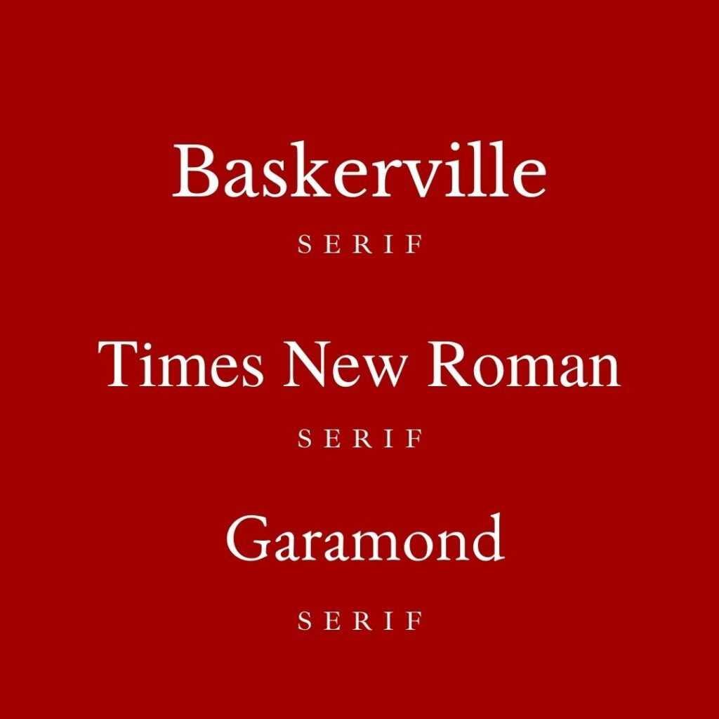
Some of the most popular serif fonts include Baskerville, Times New Roman and Garamond as seen above.
SANS SERIF: This font type, unlike ‘serif’ do not have a tail or feet at the end of letters and numbers. Sans serif have a more modern, clean and simplistic feel about them, used in logos by brands such as LinkedIn, Adidas and even Facebook.
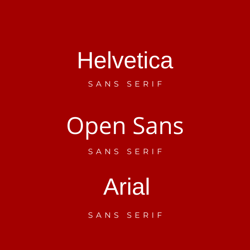
Sans serif fonts include Helvetica, Open Sans and Arial as seen above.
SCRIPT: This typeface incorporates a handwritten style, with almost no straight lines. These can be perceived as a luxurious and elegant typography, in turn it can be totally unique to set your brand apart. Used by some of the major brands such as Coca Cola, Kelloggs and Kleenex.
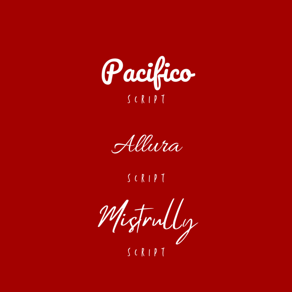
There are hundreds of custom script types of fonts, some of the most used being Allura and Pacifico.
DISPLAY: Display fonts are unique in the sense that each font type has some sort of specialised element such as shadowing, outlines, odd shapes to individual letters and even artistic edges.
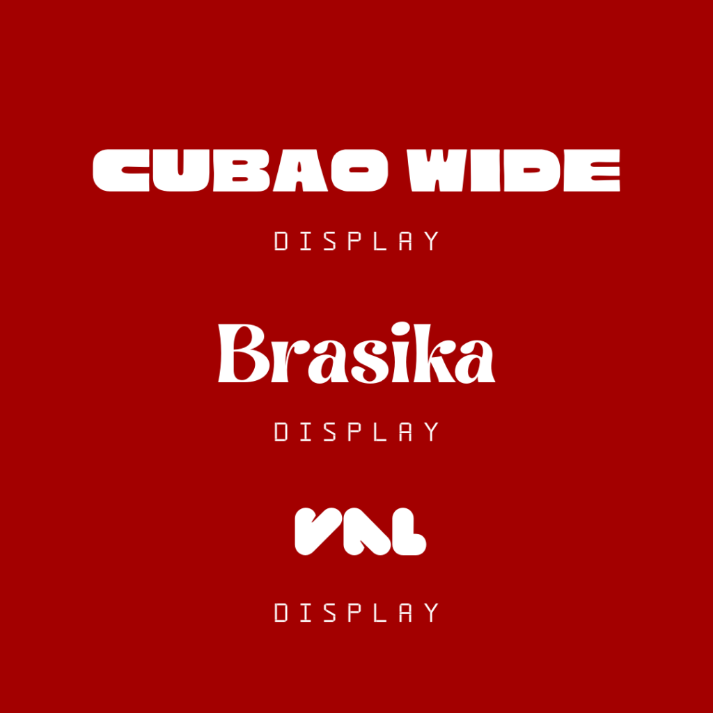
The opportunities are limitless with this particular set of typography. Using such fonts with logos will certainly make you stand out form the crowd.
When choosing a set of typography for your brand identity, its important to note that using too many fonts can convolute your image, try to stick to using up to three max, maybe one for heading, and one for subheadings and body of text. Picking fonts that contrast and compliment each other is also important. It is also wise to chose a font that has multiple weights and styles so you can stay within the theme, but switch it up from time to time.
FORM

Consideration should be made when it comes to applying shapes or form to your geometry design. It can be used to subconsciously implant brand image; for instance, using soft edges and circular shapes will have a far different impact than a using shapes with sharp edges like triangles.
LINES: Straight vertical lines can be perceived as powerful and dominant while horizontal lines may portray long lasting and preciseness. Wavy lines on the other hand, may give off a more tranquil feel to the brand.
ROUND: These can be spheres, eclipses and oval. These types of shapes give off the sense of gentleness, unity and earthiness to a brand.
EDGES: Triangles, squares and rectangles can be used to give the sense of stability and strength a brand. These shapes can make your brand identity look dynamic and assertive.
Sometimes just using geometric compositions that look good is not enough, paying close attention to what it could mean and the values associated with your brand is important to take into consideration.
Brand Identity Design
Once the foundations have been laid down, it’s time to become an architect and build the brand identity design on top. Here you will bring your brand philosophy to life with tangible marketing assets and expressing your brand identity with a number of elements and different mediums. Most businesses can benefit from applying the developed brand identity within the all brand design aspects. However, it is not strictly necessary to implement them with all types of businesses. For instance, a coffee shop should concentrate more on their interior design and perhaps their menu. An affiliate marketer, on the other hand, should focus more on the website, email design and social media aspects.
Let’s take a dive into the element used in the design of brand identity. Remember, that we already established the foundations, or the building block that we use when incorporating it within the design elements.
LOGO
Logo are synonymous with all brands, be it an emblem or wordmark, it can usually act as the first point of contact for you brand identity, and for this reason it is important to factor in the core of your brand. Almost all organisations and businesses use a logo to distinguish themselves. Hospitals, football teams, dog groomers and even individual content creators use some type of logo that represents them.
It is important to factor in the following when having a logo designed:
COULOR PALETTE: We have discussed this in the brand development portion. It is essential to stay uniform and try to factor in your brand colour(s) into the logo, though this is not always necessary if you are using a unique, distinctive logo design. It would advisable to have a logo designed that can be used in black and white for different backgrounds.
FORM: Remember what shapes can tell one about a brand. If you are to use a pictorial mark or abstract logomark as part of the logo design, don’t forget to pay attention to form, If you want to use rounded curves as opposed to sharp corners or lines, they all can give a different sense of the brand identity.
TYPOGRAPHY: If you intend on using a wordmark or monogram for your logo, the typography you chose can have a significant effective how your brand can be perceived. Certain types of fonts lean towards being bold and more corporate orientated such as serif fonts, as where other types of fonts can give off a subtle more feminine vibe.
FUTURE-PROOF: Trying to strike the balance of having a modern trendy logo and a classic logo is advisable. You don’t want the style of the logo to become redundant after a year or so, and the same time you don’t want to make it feel too dated. Having a more simplistic logo lends well here, as if you ever need to update it, then it will be an easier task for the designer and for the customers to still recognise your brand logo. Further on, we analyse Firefox in our case study, and show how they encountered issues with refreshing their logo without losing their identity.
IMPACT: This is easier said than done. Designing a logo that creates an impact and has a lasting impression should be the objective, Research logos that have done just that, some logo are timeless, especially typography or wordmark based logos, but you shouldn’t forget that the logo should clearly emphasise the company ethos and brand values.
Learn more about different types of logos
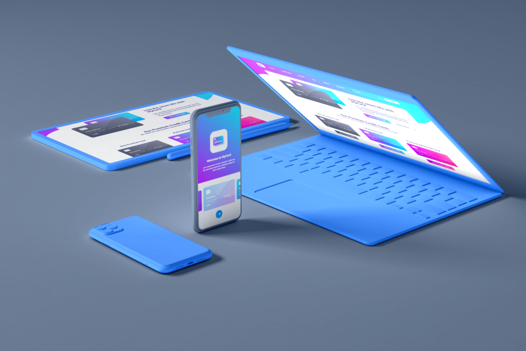
WEBSITE
Let’s face it, if you don’t have a website in todays modern Internet era, you’re going to look like a dinosaur. Buyers usually go through a five step buying process before purchasing, most do this subconsciously. So step one; is it a need or a want? Step two; Is there an alternative, and it is in this step that people do research. Most jump online and are most likely to have a look at your website to grasp a gauge. This is even more prevalent, if you have an online business or are offering digital products.
Some will perceive websites to be only on screen images and text, but would be sadly mistaken. Websites offer an excellent opportunity to express your brand identity. Take a look at how you can incorporate your the foundations of your brand identity within web design.
COULOR SCHEME: Just like with your logo design, this is a perfect opportunity to add the splashes of colour related to your brand. You can do so on buttons, where you may use your primary colour as the background and then on hover, use your secondary colour. Brand colours can also be used in headings, menu, banners, hyperlinks and even social share icons.
FORM: Using shapes in web design is also and effective means of implanting the businesses brand identity, though this has to be subtle. This can be achieved by using section dividers, using unique shaped buttons and even using illustrations and images with the key elements of the chosen form.
IMPACT: Think of your website as your receptionist. It will be, for most, the first point of contact with your business or organisation. You should greet them warmly, subtly let them know where they are and what they can expect, and also how they can make further contact. Using images to break up text in web design is fundamental, you don’t want visitors to feel like they are reading an essay. Try and use images that portray your service or products, and the secret is to keep them engaged, by offering something that may not always want, but need.
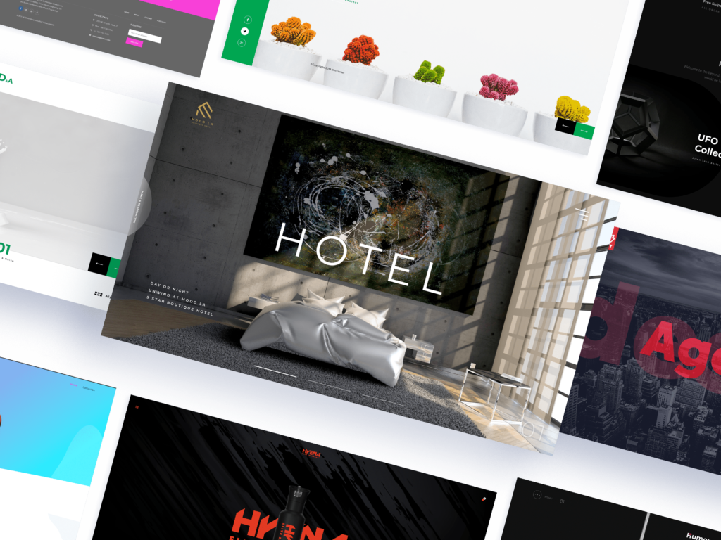
For an experienced professional web designer that incorporates brand identity within their web design, look no further than Nocturnal Lab.
DIGITAL MARKETING
Wether you’re an online business or selling physical products in store, chances are you’re going to need to invest on some digital marketing. There is a host of options in which you can deploy a strategic marketing campaign. Let’s have look.
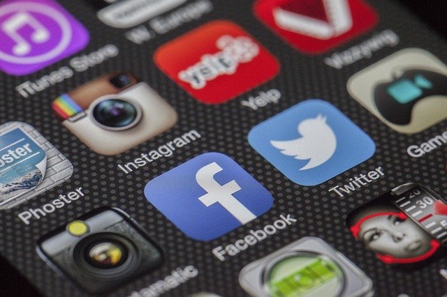
SOCAIL MEDIA MARKETING: The use of social media has exploded onto desktops and mobile devices over the past decade, and theres no signs of it slowing. We have the big players such as YouTube, Instagram and Twitter, but every now and then, a new form manages to find a gap on the social media train such as Tik Tok. Every organisation type, from carpenters to political parties, now utilise the power of social media. It is wise to invest time on maybe one or two of these platforms, and when doing so, add quality, educational material rather than straight sales pitches and offers.
So for instance, if your were a carpenter, then Instagram would be ideal for posting images of not only your work, but advice on what is the most suitable wood for kitchen cabinets. Then you could post a tutorial video guide on YouTube about how to measure your walls for kitchen cabinets. Taking time in creating a theme for post and videos is advisable as you will become instantaneously recognisable when someone sees your thumbnail or post. These platforms are not only free and reach a large audience, but in some cases you can also get paid for helping your self grow your business.
SEARCH ENGINE MARKETING: This is all about getting your website to the top of SERPS (search engine results pages) when someone is searching your services or products, your brand and also relevant keywords and phrases. Google, the biggest search engine, shows organic and paid search traffic. Search engine optimisation (SEO) focuses on improving organic traffic by implementing on-page and off-page SEO.
Pay per click (PPC) is simply paying to improve your ranking position for particular keywords and phrases. Every time someone click on the link (that has an ad label on the top), you pay for that traffic, different keyword competitions influence the price, the more competitive, the more expensive.
Here you can create unique landing pages and use funnels to generate leads, but implementing your identity in is essential to grab and keep their attention. Its all about keeping the visitor engaged, and you should pay particular attention to the brand language you use to reinforce your service or products.
E-MAIL MARKETING: Language and design is the core of this campaign. With people getting bombarded with emails daily, it’s tough to stand out amongst the rubble. Email marketing when done right, can be super effective especially when tailored to make it personal. Keeping it simple and to the point is important in this form of communication. Adding images can help especially if you are promoting a new product.

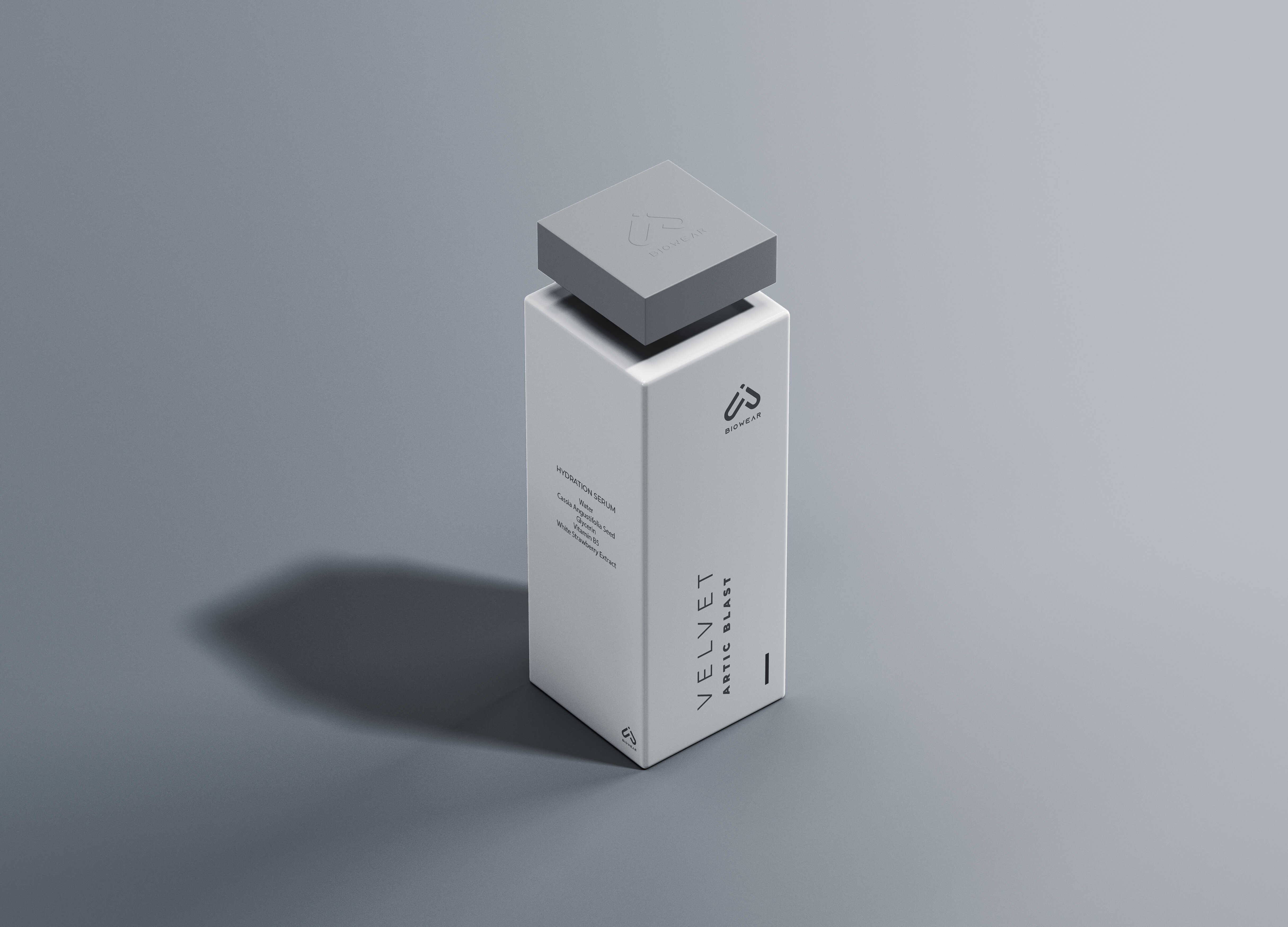
PRODUCT PACKAGING
The old saying ‘don’t judge a book by its cover’ has been around for decades, yet people do just that. The same applies when people are buying physical products. Incorporating good design can lead to sales, but one mustn’t forget to incorporate their brand identity within the product packaging. Doing so will help establish a reputation of the brand and associations can be made with other products in the range or products that are entirely different. If your product is cluttered on the shelf with sea of others, having distinctive packaging will enable your loyal customers to identify you quickly.
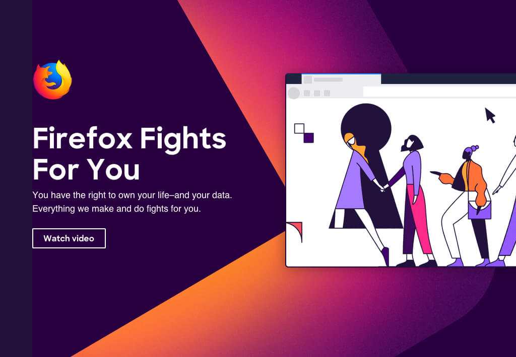
FIREFOX BRAND IDENTITY CASE STUDY
Firefox are a tech brand best know by consumers as a web browser. But as Firefox started developing a suite of new products and services, they need to improve their brand identity and in turn, change their brand image. The intention for their brand positioning ‘is improving online life for people and improving the internet’.
BRAND PURPOSE: They set an objective was to help people believe they had their best interest at heart, making them safer and more empowered online.
BRAND PROMISE (BRAND IDENTITY): ‘Firefox Fights for you’
CONSUMER TAKEAWAY (BRAND IMAGE): ‘Firefox is on your side’
Firefox believe they appeal to the ‘Conscious Chooser’, which they define as people that make a conscious decision to invest in brands that they believe align with their personal beliefs. This audience is then broken down into two segments.
ADVENTUROUS AMPLIFIERS: This segment of the audience’s focus is on them exploring all that that internet has to offer, but have little to no interest of the browsers that gets them there. They lean more towards an emotional brand experience in which may enhance their personal image, which they can then share with friends and family.
CARING CONFIDENTIALS: This segment is made of up those that are wary of security, and those that deem Firefox to be the best in class data and security protection; also because they may feel as they are supporting the ‘good guy’.
PERSONALITY
Firefox set out with four words to define their brand personality; Opinionated, Open, Radical, Kind. They believe with these four words, it cultivate a shared vision of the brand and enables them to achieve consistency in tone, design and spirit.
OPINIONATED: Products prove that they are driven by strong convictions
OPEN: Firefox aims to make transparency and global perspective integral to their brand. Their objective is to be: ‘Open-minded. Open-hearted. Open source’.
RADICAL: Firefox believe that it is a radical act to serve the customers before themselves and to be optimistic about the internet.
KIND: Firefox want to lead by example and do whats best for the world and internet by building better products, starting conversations, partner, collaborate, educate and inform.
LOGO
As Firefox introduced new products and services, they were tasked with creating a universal logo the represented Firefox as a whole. The challenge was to build a logo that was not the same, yet was recognisable to the world and build on top of their current recognition. The primary log for the parent brand is the logotype and logomark together.
LOGOTYPE: The Firefox logomark is a custom mark based on the Firefox SharpSans typeface.
LOGOMARK: Refers to Firefox the product company, not Firefox the web browser
COLOURS
Firefox opted to use eight core hues, used both as solids and gradients. This was because the colour logo for each product and services should be present in the parent Firefox logo. Firefox are unique in the sense that are able to get away with using such a vast array of colours to fit within their brand as it stems from their most recognised logo of their browser.
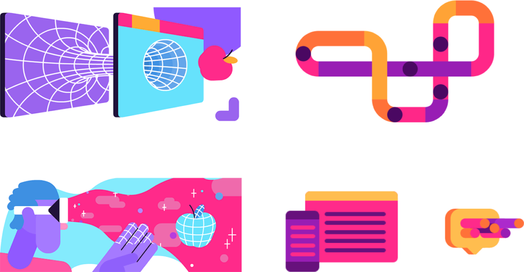
VISUALS (SHAPE & FORM)
Firefox’s shape system was born from the geometry of the product logos, forming background patterns, spot illustrations, motion graphics and pictograms. If you think back to what we discussed earlier in ‘Shapes/Form’, you will see they opted for rounded edges that ties in with the brand objective, of being friendly.

TYPOGRAPHY
Firefox use two main font types, both of which are are sans. Metropolis is the font used for headlines on marketing and product web experiences, this sans geo font is very similar to the one used in the logotype of SharpSans.
Inter is the font utilised as their secondary typeface, for use in paragraph text and small UI elements.
FIREFOX BRAND IDENTITY & BRAND IMAGE
If we look back at all we explored in terms of brand identity and brand image, you can see that when developing the Firefox brand, they evaluated everything from how they are, and want to be perceived by the world. In terms of brand image, to the shapes and typography used coinciding with their set brand mission objectives.
If you remember the four key words that defines their brand, Opinionated, Open, Radical and Kind, then you find a correlation with what we discussed in terms of the design of the brand how different elements can give a different meaning. For instance, they used round edges to show that they are Kind and used serif fonts to show that they are modern and Dynamic.
Check out the video below to learn more about the evolution of the Firefox brand.
BRAND IDENTITY TAKEAWAY
Hopefully by now you have a good grasp and understanding of brand identity and other factors that coincide with it. We have explored brand identity, brand image, brand identity prism and illustrated how they all interconnect with each other. We have explored how to create a foundation for your brand and how to build upon this with brand design, incorporating elements such as colour and typography to achieve this. Follow these guidelines and you are sure to deliver and covey your message intended for your audience and hopefully build a healthy brand for now and the future.
The Author
Kormani
Lead Design Engineer at Nocturnal Lab
Kormani is the lead developer at Nocturnal Lab. When he is not designing, you can catch him writing novels, playing video games, and watching television shows (did we mention he is constantly studying too!!!!)
Recent Comments